FRAEM
Controlling natural light to elevate each living space
VIEW THE SITE
fraem.co.uk
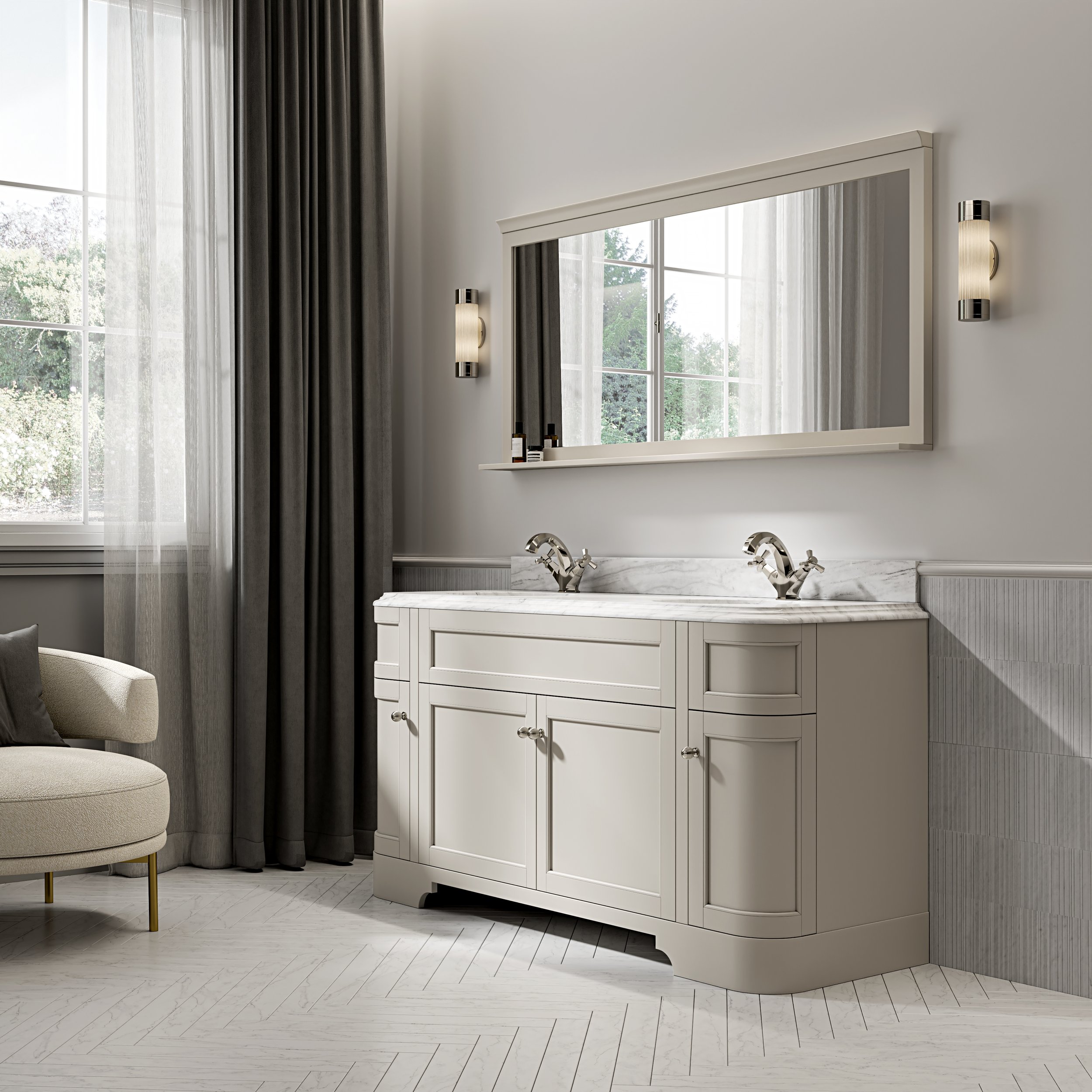
SUM partnered with FRAEM to build a new brand from the ground up, crafting the name, strategy, identity and digital experience for a specialist provider of high-end window furnishings. Based in London and active across the GCC, FRAEM designs and installs tailored solutions for both private residences and large-scale commercial developments.
With a growing reputation among architects, property developers, and interior designers, FRAEM wanted a brand that would reflect the quality and custom nature of their work. They offer both traditional and motorised systems – from soft drapery to sleek automated blinds – but the previous presentation lacked the restraint, elegance and precision that characterise their installations.
SUM was asked to create a brand that would position FRAEM at the top end of the market, conveying luxury and technical excellence without visual noise or overstatement.
Our approach was built around a single principle: controlled simplicity. FRAEM’s offering is defined by its subtlety – enhancing a room through tone, movement, and light – and the brand needed to do the same. The strategy focused on reinforcing FRAEM’s role as a silent partner to design-led interiors, allowing the spaces themselves to shine.


Our approach was built around a single principle: controlled simplicity. FRAEM’s offering is defined by its subtlety – enhancing a room through tone, movement, and light – and the brand needed to do the same. The strategy focused on reinforcing FRAEM’s role as a silent partner to design-led interiors, allowing the spaces themselves to shine.
The FRAEM logotype is architecturally inspired - linear, balanced, and quietly distinctive. Supporting typography is neutral but elegant, allowing product imagery and spatial composition to take centre stage. The colour palette leans into graphite, stone and off-white tones, mirroring the calm, controlled feel of the spaces FRAEM helps shape. Motion was introduced as a core asset - not through overt animation, but through slow, directional transitions and scroll-based movement across the website and pitch decks.
The website was designed to feel like a digital showroom - clear, spacious, and intentionally restrained. Product categories are minimal but clear, and technical information is layered intuitively for both end clients and trade professionals. In parallel, SUM developed B2B credentials decks and commercial templates, ensuring the brand remains consistent across all use cases - from premium residential clients to white label commercial projects.